Go Back
Top UI Design Trends & Inspiration for 2026
Discover 2026’s leading UI trends, examples, and techniques—from micro-interactions to immersive layouts—to refresh your projects and spark new ideas.
January 12, 2026

Ivan S
Founder @bookmarkify
Discover 2026’s leading UI trends, examples, and techniques—from micro-interactions to immersive layouts—to refresh your projects and spark new ideas.
January 12, 2026
Ivan S
Founder @bookmarkify
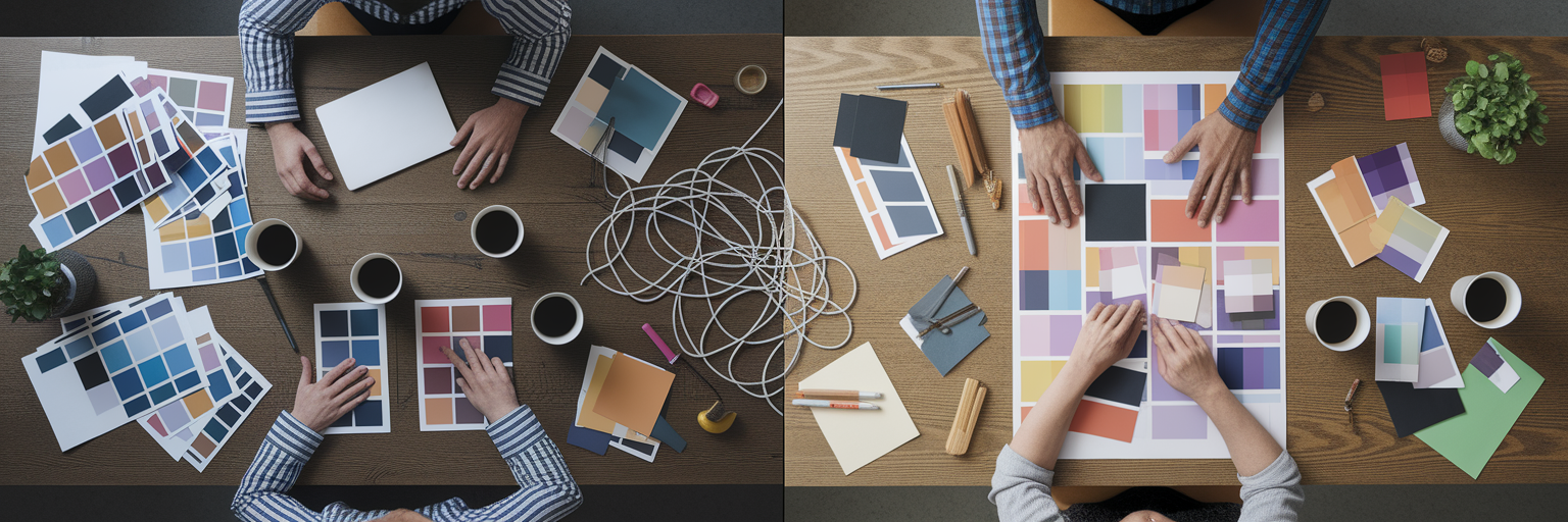
Looking for inspiration UI design? This list showcases 10 exciting UI trends to elevate your design projects. Discover how minimalism, neumorphism, glassmorphism, dark mode, microinteractions, 3D elements, asymmetrical layouts, data visualization UI, brutalist web design, and motion design systems can transform user interfaces. Explore these diverse styles and find the perfect inspiration UI design for your next project. To save inspiration, you can use Bookmarkify.
Minimalist design is a powerful approach in UI design that prioritizes simplicity and clarity. It focuses on stripping away unnecessary elements and decorative features, leaving only the essential components needed for a user to achieve their goals. This results in clean, uncluttered interfaces that enhance user focus and improve the overall user experience. This philosophy makes it a go-to method for crafting elegant and effective digital experiences, earning its spot on this list of inspiring UI design approaches. It's about achieving more with less, letting the content and core functionality shine through. This approach is highly relevant for creating user-centered designs that are both aesthetically pleasing and highly functional, making it a valuable source of inspiration UI design.
Minimalist design is characterized by several key features: generous use of white space, a limited color palette, simple typography, content-focused layouts, and a clear visual hierarchy established through subtle design choices. This combination creates interfaces that are easy to navigate and understand, allowing users to interact with the content efficiently.
Examples of Successful Implementation:
When and Why to Use Minimalist Design:
Minimalist design is particularly effective when you want to:
Pros:
Cons:
Tips for Implementing Minimalist Design:
Popularized By:
The principles of minimalist design have been championed by influential figures like Dieter Rams (industrial designer), Apple under Jonathan Ive, the Swiss Style/International Typographic Style movement, and Ludwig Mies van der Rohe (architecture). Their work continues to inspire designers today.
Neumorphism, also known as neo-skeuomorphism, is a modern UI design trend that offers a fresh perspective on how we create digital interfaces. It bridges the gap between skeuomorphism (design that mimics real-world objects) and flat design, resulting in a soft, almost tactile aesthetic. If you're looking for inspiration UI design, Neumorphism deserves a spot on your radar for its ability to add subtle depth and a unique visual appeal.
Essentially, Neumorphism uses a clever interplay of subtle shadows and highlights to create the illusion of elements being either pressed into or extruded from the background. This gives the interface a soft, plastic-like appearance, almost as if you could reach out and touch the buttons. This tactile quality can create a more engaging user experience, making it a valuable tool for inspiration UI design.
How it Works:
Neumorphism relies on a monochromatic color scheme with subtle variations in shade to achieve its signature look. The magic lies in carefully positioning two shadows—one dark and one light—to simulate depth. Rounded corners and soft edges further enhance the smooth, almost pillowy effect. The low contrast between elements and the background is a key characteristic, giving the design a cohesive, unified look.
Features of Neumorphism:
Pros:
Cons:
Examples of Neumorphism in Action:
Tips for Implementing Neumorphism:
Popularized By:
While pinpointing the exact origin is difficult, designer Alexander Plyuto is often credited with helping to popularize the style. The Dribbble community and UI/UX designers on social media also played a significant role in its rise to prominence. Apple's evolution of iOS design has also incorporated elements of neumorphism, further contributing to its visibility within the design community.
Neumorphism, when used effectively, can bring a fresh and modern feel to your UI designs. By understanding its strengths and limitations, and by following the tips provided, you can harness its unique qualities to create engaging and visually appealing digital experiences. For designers seeking inspiration UI design, Neumorphism offers a valuable avenue for exploration and innovation.
Glassmorphism is a modern UI design trend that adds a touch of elegance and depth to interfaces. It's characterized by frosted glass-like elements, giving the impression of looking through translucent surfaces. This effect is achieved through the clever use of transparency and blur, allowing background content to subtly peek through while keeping the foreground elements in focus. This approach offers a fresh perspective on layering and visual hierarchy in UI design, moving beyond traditional drop shadows and solid backgrounds. This style adds a unique aesthetic that can make your designs stand out, making it a valuable tool for inspiration UI design.

Glassmorphism distinguishes itself through several key features: frosted glass transparency effects, background blur, subtle borders on translucent elements, a multi-layered interface with depth, and even light refraction and reflection effects. These combined create a sense of visual richness and sophistication. This approach excels at creating depth and hierarchy without relying on heavy shadows, leading to a modern and sleek aesthetic. By partially revealing background content, glassmorphism provides context and creates a visually unified experience. It works exceptionally well with colorful backgrounds and imagery, allowing designers to create truly captivating interfaces.
Examples of successful glassmorphism implementations can be found across popular platforms. Microsoft's Windows 11 interface utilizes glassmorphism extensively, as does Apple's iOS control center. Spotify's mobile app also incorporates glassmorphic background elements, and it's become a popular choice for modern dashboard designs. MacOS Big Sur and newer design language also showcase the effective use of this style. These examples demonstrate the versatility of glassmorphism and its ability to enhance a variety of digital experiences. These real-world applications provide excellent inspiration UI design.
However, glassmorphism isn't without its drawbacks. Performance can be an issue on less powerful devices due to the processing required for blur effects. Accessibility is another concern, as transparency can make text difficult to read for some users. Careful color management is crucial for maintaining readability against blurred backgrounds. Overuse can lead to visual clutter and confusion, so it's best used strategically for key interactive elements rather than the entire interface. Finally, older browsers may not render glassmorphism effects correctly, requiring fallback solutions.
To effectively implement glassmorphism in your designs, consider these tips: use backdrop-filter in CSS for browser implementations, ensuring a minimum opacity of 70% for readable content. Adding thin, light borders (around 1px) to translucent elements helps define their edges and improves visual clarity. Test your designs on various backgrounds to guarantee readability across different contexts. Remember to use glassmorphism sparingly, focusing on key interactive elements or sections to maximize its impact without overwhelming the user.
Glassmorphism earned its place on this list of inspiring UI design trends for its ability to inject a sense of modern elegance and depth into interfaces. While careful implementation and consideration of accessibility are crucial, its unique visual qualities make it a powerful tool for designers seeking to create captivating and contemporary digital experiences. It's popularization can be attributed to the influence of Microsoft's Fluent Design System and Apple's iOS and MacOS interfaces, along with prominent UI/UX designers like Mike Malewicz and trends seen on platforms like Dribbble and Behance.
Dark mode design has quickly become a staple in modern user interfaces, offering both aesthetic and practical benefits. It's a color scheme that utilizes light-colored text and UI elements on dark backgrounds, creating a visually striking contrast. This approach wasn't just born out of a desire for a sleek new look; it offers several advantages that contribute to a better user experience, securing its place as a key consideration in inspiration UI design.

Dark mode interfaces typically employ black, dark gray, or dark blue backgrounds, paired with light or brightly colored text and UI elements. This inverted color scheme reduces the overall brightness of the screen. Strategic use of accent colors further enhances the visual appeal and helps draw attention to important interactive elements. A crucial aspect of implementing dark mode effectively is paying meticulous attention to contrast ratios to ensure readability and accessibility.
Features of Dark Mode Design:
Pros:
Cons:
Examples of Successful Dark Mode Implementation:
Tips for Implementing Dark Mode:
Why Dark Mode Deserves Its Place in Inspiration UI Design: Dark mode has become more than just a trend; it's a valuable design approach that caters to user needs and preferences. It offers practical benefits like reduced eye strain and improved battery life, while also elevating the aesthetic appeal of an interface. Its widespread adoption by major tech companies and platforms further solidifies its importance in the world of UI design. By understanding its principles and best practices, designers can leverage dark mode to create engaging and user-friendly digital experiences.
Microinteractions are the subtle animations and feedback mechanisms that breathe life into a user interface. They are the small, almost invisible details that elevate a good design to a truly great one. For anyone seeking inspiration UI design, understanding and implementing microinteractions is crucial. They play a significant role in enhancing user experience by providing visual cues, confirming actions, and guiding users seamlessly through processes. These seemingly insignificant moments create engagement, delight, and dramatically improve usability within any digital interface. That's why they deserve a prominent place on this list.
How Microinteractions Work:
Microinteractions function by responding to specific user triggers. These triggers can include clicking a button, hovering over an element, submitting a form, or even pulling to refresh a feed. The resulting animation or feedback provides the user with immediate confirmation of their action and often includes a visual indication of the system's status. Think of them as the subtle nods and gestures in a human conversation – they facilitate communication and create a sense of connection.
Features of Effective Microinteractions:
Pros:
Cons:
Examples of Successful Implementation:
Tips for Implementing Microinteractions in Inspiration UI Design:
Popularized By:
Dan Saffer (author of 'Microinteractions'), Apple's Human Interface Guidelines, Google's Material Design motion principles, animation tools like Lottie, Framer, and Principle, and products like Stripe, Airbnb, and Mailchimp have all contributed to the popularization and understanding of effective microinteraction design.
By focusing on these seemingly small details, designers can significantly elevate the user experience and create truly inspiring UI design. Microinteractions add that extra layer of polish and sophistication, making the interface feel more responsive, engaging, and ultimately, more human.
3D elements in UI design bring the immersive qualities of three-dimensional objects, illustrations, and effects into the typically two-dimensional world of user interfaces. This technique adds depth, engagement, and visual interest, transforming flat interfaces into dynamic and interactive experiences. From subtle 3D icons to fully realized 3D environments, this approach opens up a realm of possibilities for creating digital products that are both beautiful and engaging. 3D elements can elevate your inspiration UI design, making your work stand out.

This approach elevates UI design by offering a richer, more tangible user experience. Features like 3D rendered objects and illustrations, isometric perspectives, and depth created through lighting and shadows contribute to a more realistic and captivating visual landscape. Interactive 3D elements that respond to user input, coupled with animated transitions with dimensional movement, further enhance the sense of immersion and playfulness.
Think of Apple's macOS icons and product renders – the subtle use of 3D gives them a polished and premium feel. Pitch.com leverages 3D presentation elements to create engaging and dynamic slideshows. Stripe utilizes 3D payment illustrations to add personality and delight to their platform. Spline.design creates entirely immersive 3D web experiences. Even Figma has recognized the power of 3D with its 3D plugin integrations. These examples demonstrate the versatility and impact of 3D elements in modern UI design.
Pros:
Cons:
Tips for Implementing 3D Elements:
3D elements in UI design offer a powerful way to enhance visual appeal, improve user engagement, and create truly memorable digital experiences. By understanding the benefits, drawbacks, and best practices for implementation, designers can leverage the power of 3D to elevate their work and create interfaces that stand out in the increasingly competitive digital landscape. This technique deserves its place on this list for its ability to transform user interfaces into engaging and immersive experiences, pushing the boundaries of inspiration UI design.
Asymmetrical layout is a powerful tool in UI design that breaks free from the rigid structure of traditional grids, offering a refreshing and engaging user experience. It deserves a spot on this list of inspiration UI design ideas because it allows designers to create visually dynamic interfaces that stand out from the crowd and effectively highlight key content. Instead of relying on mirror-image balance, asymmetrical layouts achieve equilibrium through the strategic use of visual weight, creating a more organic and captivating composition. This approach is perfect for those seeking to inject personality and dynamism into their designs.
How it Works:
Asymmetrical layouts achieve balance not through symmetry, but by carefully distributing elements of varying sizes and weights across the screen. Imagine a seesaw: a large element on one side can be balanced by several smaller elements on the other. This deliberate imbalance creates visual interest and directs the user's eye through the interface in a dynamic way.
Features:
Pros:
Cons:
Examples of Successful Implementation:
Tips for Implementing Asymmetrical Layouts in Your Inspiration UI Design:
Popularized By:
While the Swiss design movement is known for its grid systems, it also played a role in the development of asymmetrical layouts. Designers like Alexey Brodovitch explored the potential of asymmetry in editorial design. Later, David Carson and the grunge typography movement further pushed the boundaries of traditional layout. Today, modern creative agencies, fashion, and luxury brands often use asymmetrical layouts to achieve a distinctive and impactful visual identity. This technique provides a powerful way to elevate inspiration UI design, creating truly memorable user experiences.
Data Visualization UI is a powerful approach to inspiration ui design, transforming complex data into easily digestible visual stories. Instead of presenting users with walls of numbers or dense tables, this method leverages charts, graphs, and interactive displays to reveal patterns, trends, and relationships hidden within the data. This makes it an essential consideration for anyone seeking to create engaging and informative user interfaces.
How it Works:
Data visualization UI design rests on the principle of making data accessible and understandable through visual perception. It takes raw data and translates it into visual elements like bars, lines, points, and colors, allowing users to quickly grasp complex information. Interactive elements, such as tooltips, zooming, and filtering, further enhance exploration and understanding.
Examples of Successful Implementation:
Tips for Effective Data Visualization UI Design:
Pros and Cons:
Pros:
Cons:
Why Data Visualization UI Deserves Its Place in Inspiration UI Design:
Data visualization UI stands out as a crucial element in inspiration ui design because it bridges the gap between raw data and human understanding. In a world increasingly driven by data, the ability to effectively communicate complex information visually is paramount. By transforming data into engaging and accessible visuals, designers can empower users to explore, analyze, and ultimately, make better decisions. It’s not just about making data pretty; it's about making it meaningful. This approach adds significant value to any interface dealing with data, making it an indispensable tool for modern UI/UX design.
Brutalist web design offers a radical departure from polished, conventional aesthetics, providing a unique source of inspiration UI design. Think of it as the digital equivalent of exposed concrete and steel in architecture. It prioritizes raw functionality and content over visual ornamentation, resulting in a stark, often jarring, yet undeniably memorable online experience. This approach can be a powerful tool for designers seeking to break the mold and create truly distinctive interfaces.
What is it and How it Works:
Brutalist web design embraces minimalism to the extreme. It strips away superfluous design elements, revealing the underlying structure of the website. This often translates to raw HTML aesthetics with minimal CSS, monospace typography (often system fonts), high-contrast and sometimes clashing color palettes, and exposed structural elements like grids and bare-bones forms. It rejects sleek, user-friendly conventions in favor of a more raw and unfiltered presentation. This starkness and simplicity can, surprisingly, contribute to fast loading times.
Examples of Successful Implementation:
While perhaps not "successful" in the traditional sense, these examples showcase effective uses of brutalism:
Tips for Using Brutalist Web Design:
Pros and Cons:
When and Why to Use This Approach:
Brutalist web design is best suited for projects where standing out and making a bold statement are paramount. It's a good fit for:
Why Brutalist Web Design Deserves a Place in the List of Inspiration UI Design:
In an era of increasingly homogenized web design, brutalism offers a refreshing alternative. It challenges designers to rethink conventional aesthetics and explore the expressive potential of raw, unpolished design. While not always appropriate for commercial applications, it provides valuable inspiration by pushing boundaries and demonstrating that effective UI design doesn't always require sleekness and polish. It encourages us to consider the core function and message of our designs and to explore unconventional ways of communicating them. Brutalist web design serves as a reminder that sometimes, less is truly more.
Motion design systems are a crucial element of modern UI design, elevating user interfaces from static displays to dynamic and engaging experiences. They play a key role in providing inspiration UI design, offering a framework for creating cohesive and meaningful animations. This structured approach to motion ensures that every transition, animation, and micro-interaction contributes to a polished and intuitive user experience. A well-implemented motion design system is a hallmark of thoughtful inspiration UI design.
So, what exactly are they? Motion design systems are essentially comprehensive frameworks that dictate how movement and animations function within a digital product. They establish consistent principles and patterns for motion, ensuring a unified and predictable experience. This consistency reinforces brand identity, improves usability, subtly guides user attention, and even fosters emotional connections.
Key Features of a Motion Design System:
Pros:
Cons:
Examples of Successful Implementations:
Actionable Tips for Implementing Motion in Your UI Design:
When and Why to Use a Motion Design System:
A motion design system becomes essential when you're striving to create a truly polished and engaging user experience. It’s particularly valuable for complex applications or platforms where consistency and usability are paramount. By providing a clear set of guidelines for motion, a design system ensures that animations enhance, rather than detract from, the overall user experience. This contributes significantly to inspiration UI design, offering a framework for crafting interfaces that are both beautiful and functional. This approach differentiates your product, demonstrating a commitment to detail and a deep understanding of user-centered design principles, making it a worthwhile investment for any project aiming for high-quality UI design.
Design IdeaComplexity 🔄Resources ⚡Outcomes 📊Use Cases 💡Advantages ⭐Minimalist DesignLow – few elements simplify implementationLow – minimal design and development effortClear focus, faster loading and responsivenessContent-driven sites, mobile appsClean, timeless, and user-centricNeumorphismModerate – subtle shadows and highlights require careMedium – careful design details and consistencyModern, tactile feel with depthFinance apps, dashboards, modern UIsUnique depth without traditional clutterGlassmorphismModerate-high – blur effects need precise handlingHigh – performance optimizations are neededSleek visuals with layered transparencyOS interfaces, high-end design projectsContemporary aesthetic with visual hierarchyDark Mode DesignLow-medium – balancing light and dark themes demands attentionLow – requires careful color selectionReduced eye strain with enhanced focusApps in low-light environments, modern UIsElegant, battery-saving, and focus-enhancingMicrointeractionsMedium – precise timing and feedback add complexityVariable – depends on animation optimizationEngaging interfaces with improved usabilityInteractive feedback systems, web appsDelivers delightful and clear user cues3D Elements in UIHigh – 3D rendering and interactivity increase complexityHigh – specialized tools and skills requiredImmersive and memorable visual experiencesBrand presentations, product showcasesAdds striking depth and distinctivenessAsymmetrical LayoutHigh – requires balancing uneven elements carefullyMedium – demands strong design expertiseDynamic and visually interesting compositionsCreative portfolios, editorial designsExpressive and unique artistic presentationData Visualization UIHigh – complex data representation and interactivityHigh – expertise in data and design integrationTransforms raw data into actionable insightsDashboards, analytics, business intelligenceEnhances decision-making with clear insightBrutalist Web DesignLow-medium – raw, minimal styling simplifies buildLow – focuses on bare essentials and fast codingBold, fast, and distinctive interfacesExperimental sites, counter-culture brandsMemorable, performance-focused, and distinctiveMotion Design SystemsHigh – requires comprehensive planning and consistencyHigh – cross-platform motion and animation toolsCohesive user flows with guided transitionsApplications needing fluid, dynamic interactionsReinforces brand identity with purposeful motion
From minimalist interfaces to dynamic motion design systems, this article has explored a diverse range of UI design trends shaping the digital landscape. We've seen how neumorphism, glassmorphism, and even brutalist web design can each contribute unique aesthetic and functional elements to user interfaces. Mastering the application of these trends, along with crucial aspects like dark mode design, microinteractions, 3D elements, asymmetrical layouts, and data visualization, empowers you to create truly exceptional user experiences. Before diving into UI trends, it's essential to have a solid plan. A well-defined brief helps align your vision and prevents scope creep, ensuring a smoother design process. A helpful resource for this is the Website Design Brief Template: Align Your Vision from OneNine: website design brief template.
The key takeaway here is that inspiration UI design is a continuous journey. By staying abreast of evolving trends and understanding how to effectively incorporate them, you can create interfaces that are not only visually appealing but also highly functional, accessible, and user-centered. This dedication to continuous learning and exploration has a ripple effect, impacting user satisfaction, brand perception, and ultimately, the future of the digital world.
Ready to supercharge your design workflow and keep all your UI inspiration organized? Explore the power of Bookmarkify – your essential tool for collecting, categorizing, and readily accessing the design inspiration that fuels your creativity and elevates your UI design projects.
Effortlessly Save time and stay Inspired: Streamline your workflow with Bookmarkify. No more juggling 10 tabs and screenshots.